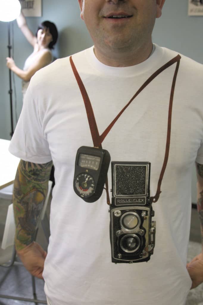
For all of the goofy print placements that we do it is a rare occasion that the finished design is truly something awesome. I mean to say that a stupid piece of “art” or a bad corporate logo placed in a funky position on the garment does not make for a great finished piece. This graphic, a photo-realistic rendering of a classic Rolleiflex camera for SF MoMa, is one of my favorite examples of clever use of graphic positioning on the garment. The design combined with well executed printing created a killer effect. This is art and it’s one of my favorite prints ever.


Comments