The Cubs and Indians are in the World Series! Who would have thunk it? Besides my thinking that if the Cubs win the next round that Theo Epstein becomes a candidate for the Baseball Hall of Fame, I have a couple of other thoughts as a t-shirt printer.
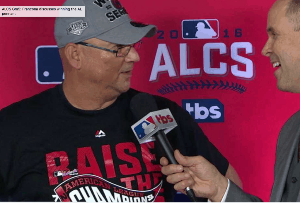
Clearly most of the t-shirt world is going towards subtle prints and soft prints. I don’t have one of the Cubs or Indians NLCS “locker room” shirts, but it looks like it is not in step with this trend. What I see is a very shiny very plastic plastisol print (unless that is Champagne on the ink…)
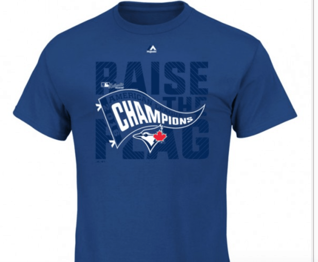
I found on a website what the Blue Jays shirt would have looked like (I was surprised to see it, since I my understanding from printing lots of Yankees, Red Sox, Patriots, Bruins and other hot market designs is that you don’t show the image before it happens and in fact you never show the image until the team wins and then only when they win.) The Blue Jays version (like that was ever going to happen…) looked a little better with the tone on tone blue, but still too much ink IMHO.
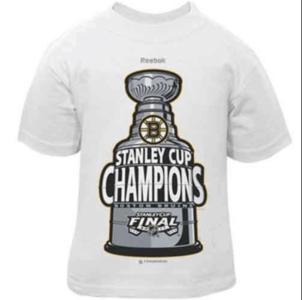
The next issue I have with it and I first noticed this when the Bruins won the Stanley Cup a few years ago, is that in an effort to focus on self-promotion over all else, the brands have their logo on the top now. This is a terrible development as it pushes the main image down to the beer belly area, a truly disturbing trend (note the Bruins image that is even more noticeable than this year’s baseball design.)
In defense of the folks that actually designed this, probably they were making art that had to be approved by about 2,497 corporate types from the league, sponsors, lawyers… etc. and art by committee is always the worst as a designer with their hands tied is not going to do their best work.




CANT WAIT TO SEE THE INDIANS WORLD CHAMPIONS SHIRTS
Lets go Cubies!
Jorge
http://www.mcallensports.com