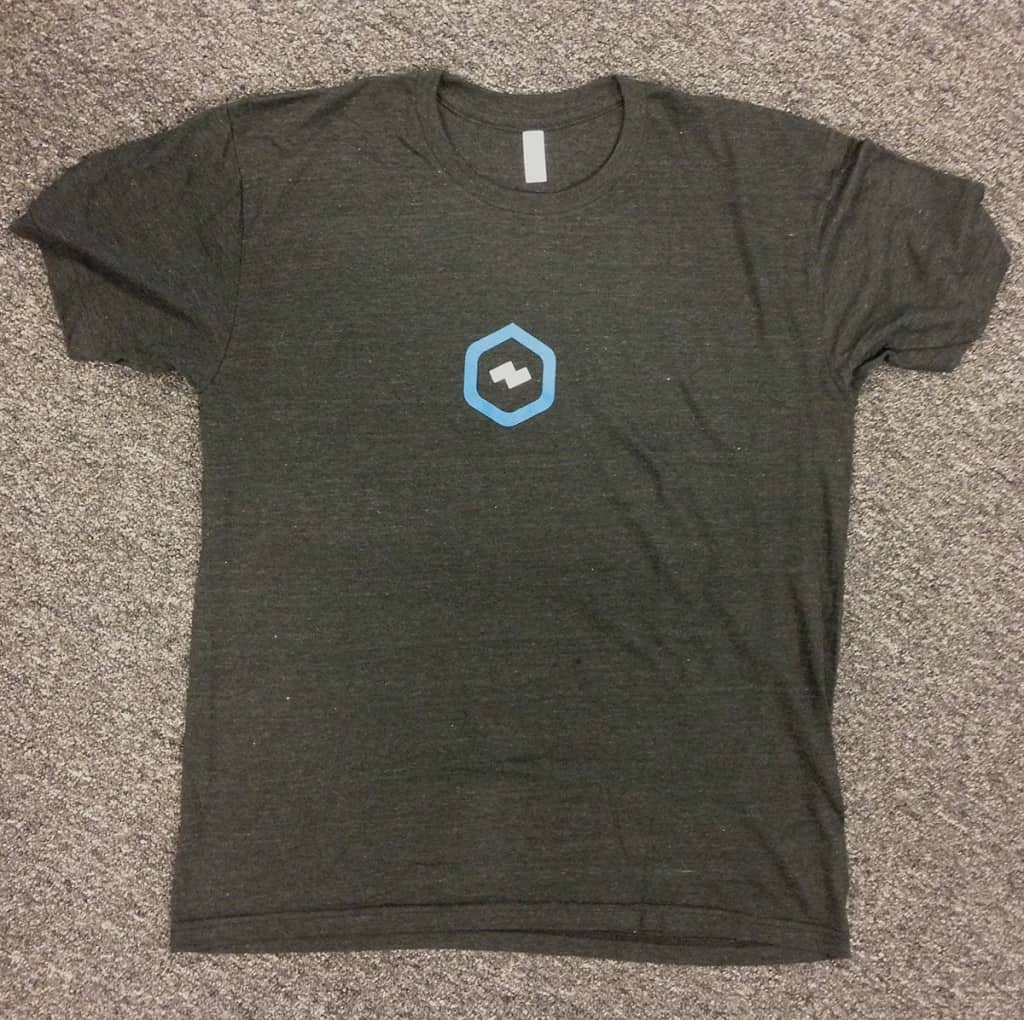
We recently had an order returned due to placement issues. The printing was “crooked and off-center”. Upon review of the returned goods we were able to ascertain the real issue…
Torquing occurs in the manufacturing process and is most pronounced on non-tubular garments constructed from lightweight, stretchy fabrics (in this case a tri-blend). The difficulty in printing such garments is in loading on press. Does a press operator load the garment straight to the panel, straight to the fabric, or straight to the garment itself? Furthermore, is the goal to make the graphic look straight and centered when lying flat or on a hanger, or should the graphic appear straight and centered when worn? No matter what, these types of garments are more difficult to print than conventional styles and require more time and care on press.
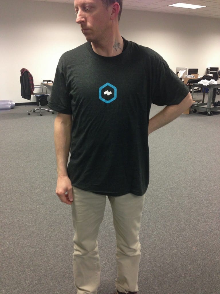
The following pictures show how a graphic can appear drastically off-placement when the garment is lying flat and yet look perfect when placed on the body (please excuse the image quality as these photos were taken in an “oh s%*t!” moment).


And if the placement appears correct on the flat garment it will appear drastically off when worn, guaranteed!
Solution: work with your customer, the designer, your art department, etc., on appropriate design for this type of garment. Stay away from straight lines of text, squared or rectangular graphics, or small centered graphics, ie: corporate stuff, and instead work with art. Organic shapes, rough edges, unorthodox placements, etc. will help hide the crooked off-placement effect caused by these garments.
Resolution: A small discount and an explanation (in the form of the photos above, photos always help to make your case) was enough to appease the customer. Learning from the mistake, we now make sure to set reasonable customer expectations on such garments and have implemented a per-print up-charge to compensate for extra time on press.

