I just spent some time in New Orleans at the Jazz and Heritage Festival with 460,000 other music lovers, most of them wearing t-shirts. Then I was in Nashville at the ISS show with shirt vendors and fellow garment decorators. Add in a few forays into gift shops and airport stores and I have a view of what is going on in t-shirt land. My conclusions from seeing all these shirts and talking to all the printers are:
– simple prints, simple prints, simple prints. Everything is a simple one color. Simple prints, tone on tone, distressed…
– soft prints on soft fabrics. Not a new trend, but even more pervasive than ever.
– The prints are simple but the garments are becoming complex. Printers are being asked to print on increasingly large variety of fabrics. American Apparel started most of this with the ringspun cotton fitted shirt and then triblends. Now there are a million variations of those and more.
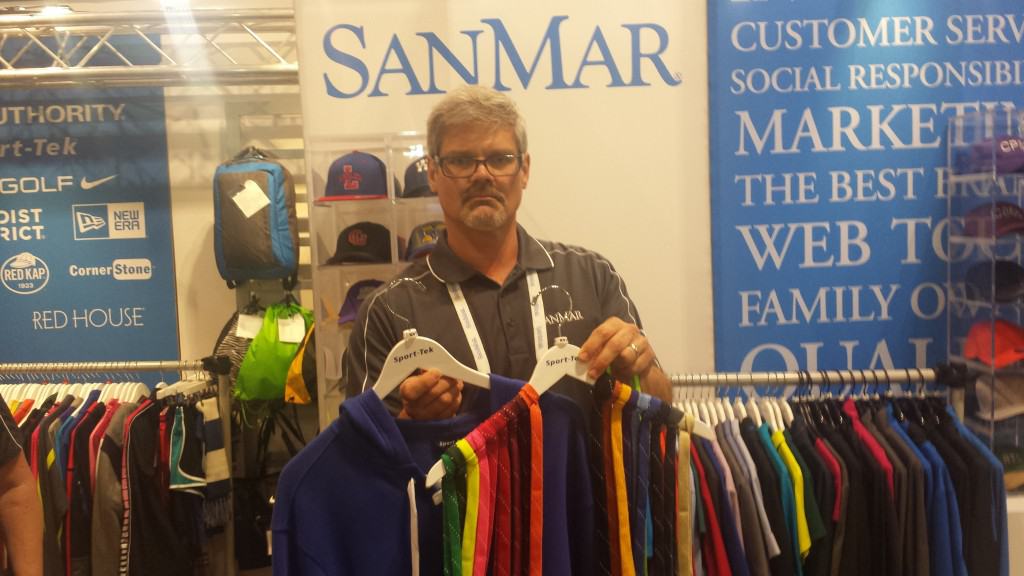
– “Performance” fabrics are here to stay and proliferating. I know for example that the Champion and Hanes performance fabrics really do seem to have special properties. San Mar’s Sport Tek fabrics are mostly dye fast. The rest of it is a crap shoot (with emphasis on the word crap) with all kinds of dye migration problems and dubious claims mixed in with the good stuff. It is a confusing landscape in this area. It is hard to figure out whether the fabrics provide anything to this world except to give printer’s nightmares. We’ll be posting more on this in posts in the coming weeks.
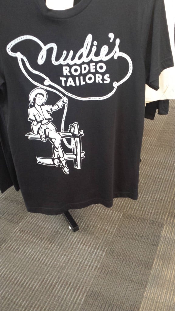
A shirt advertising Nudie, even a shirt for the maker of over-the-top custom suits has a one color shirt…
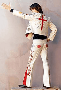
Probably the most famous Nudie suit on the late great Gram Parsons.
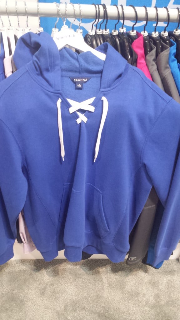
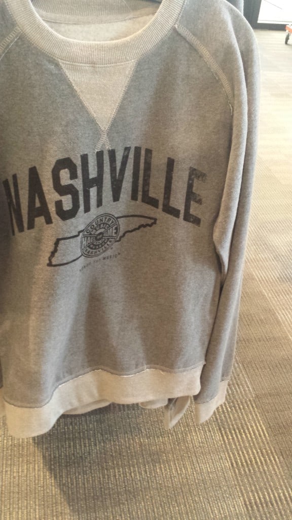
This sweatshirt by San Mar has a variety of laces that can be added. This type of garment doesn’t need anything but a simple print.
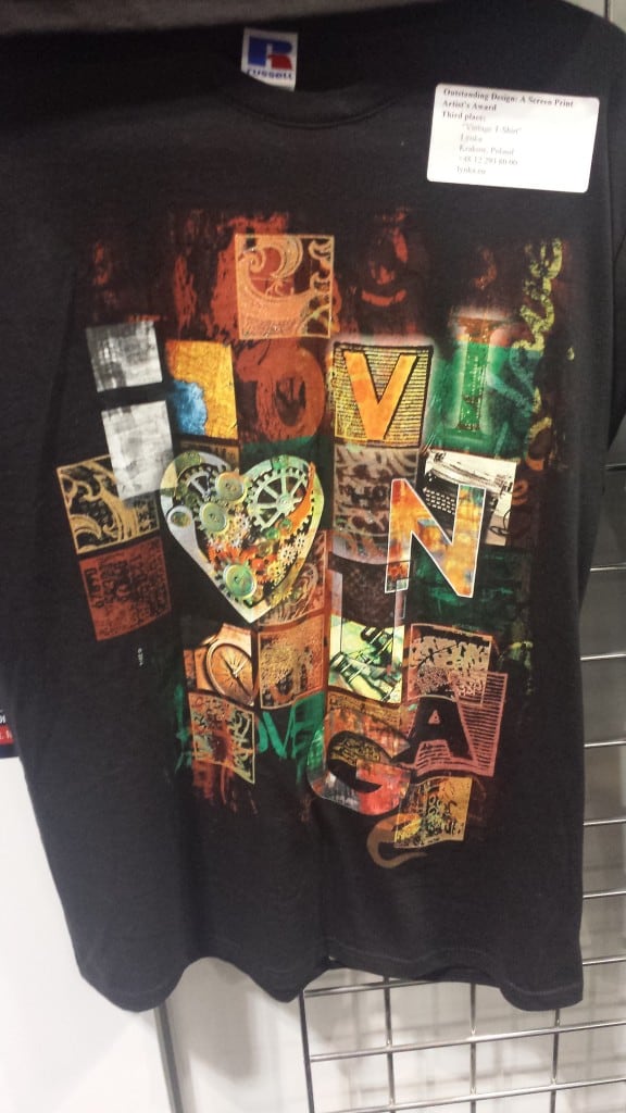
A winning entry in the Impression Awards by our pals at Lynka in Poland. Great print, but this type of complex artwork is seen less and less in the marketplace even if done well like this.
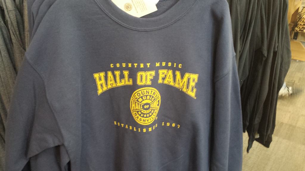
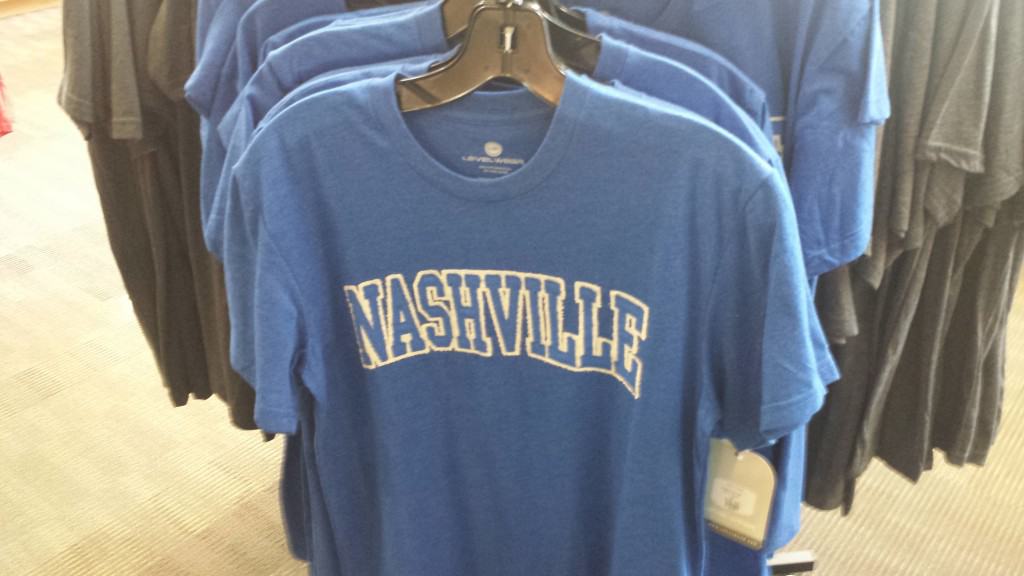
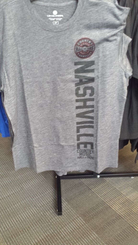
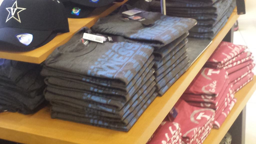
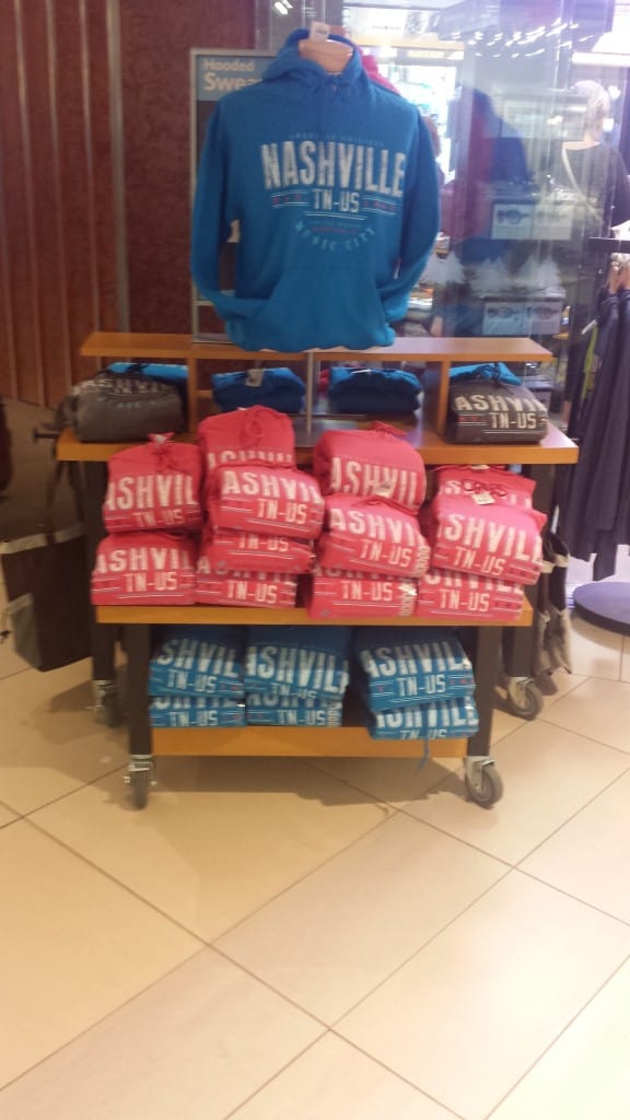
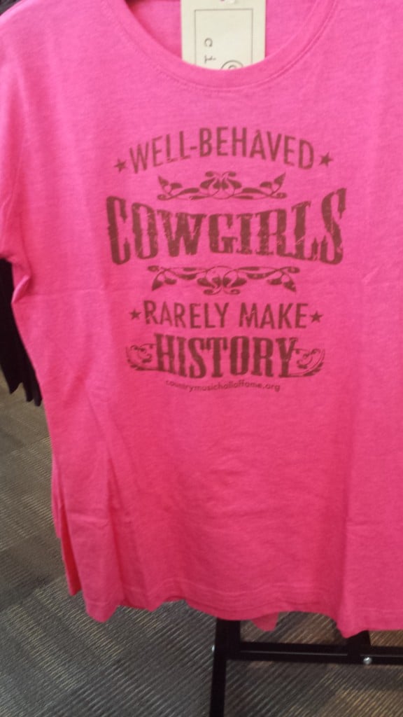
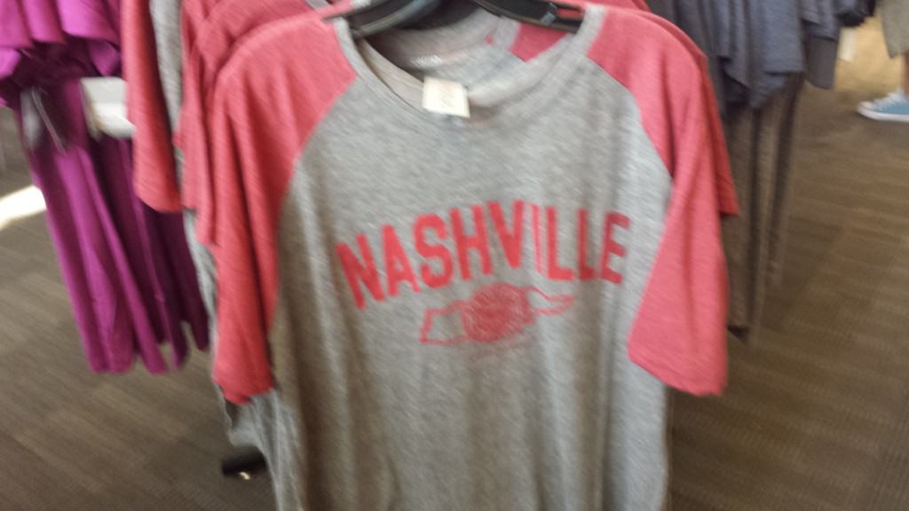
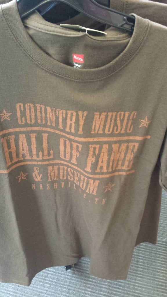
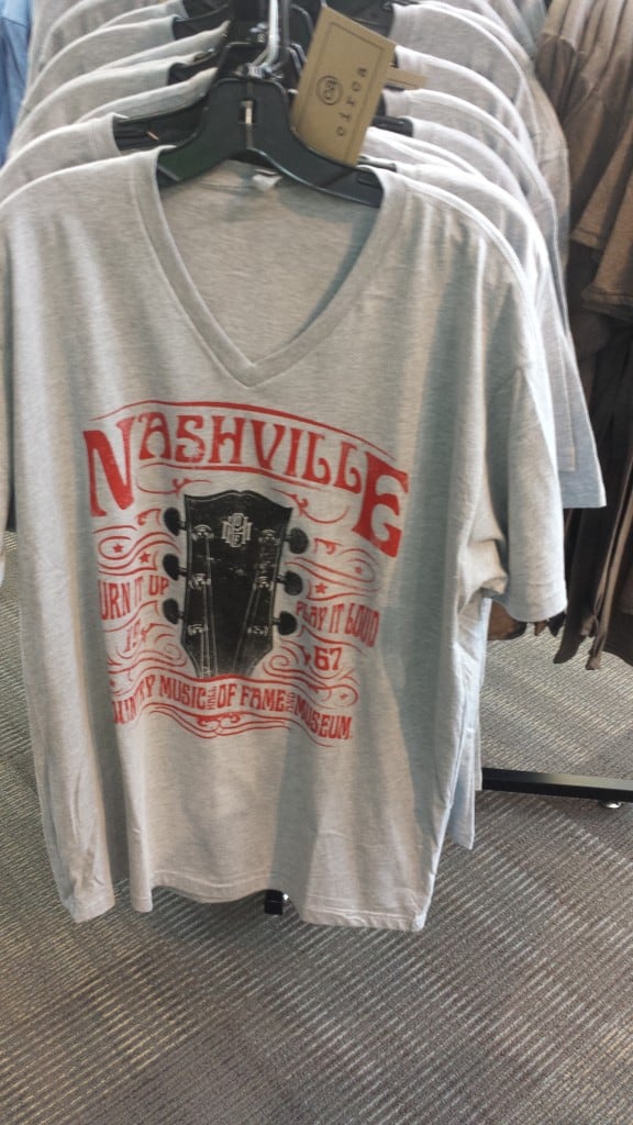
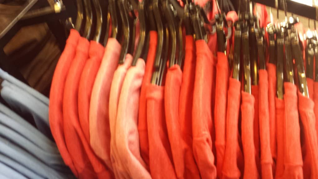
Here is a sometimes poorly photographed trip through an airport shop and one of the Country Music Hall of Fame gift shops with a couple Jazz Fest crowd shots thrown in. Even if blurry (because I grabbled these quickly from my cell) you can see that simple is currently the way.
Simple
Simple
Simple Sideways
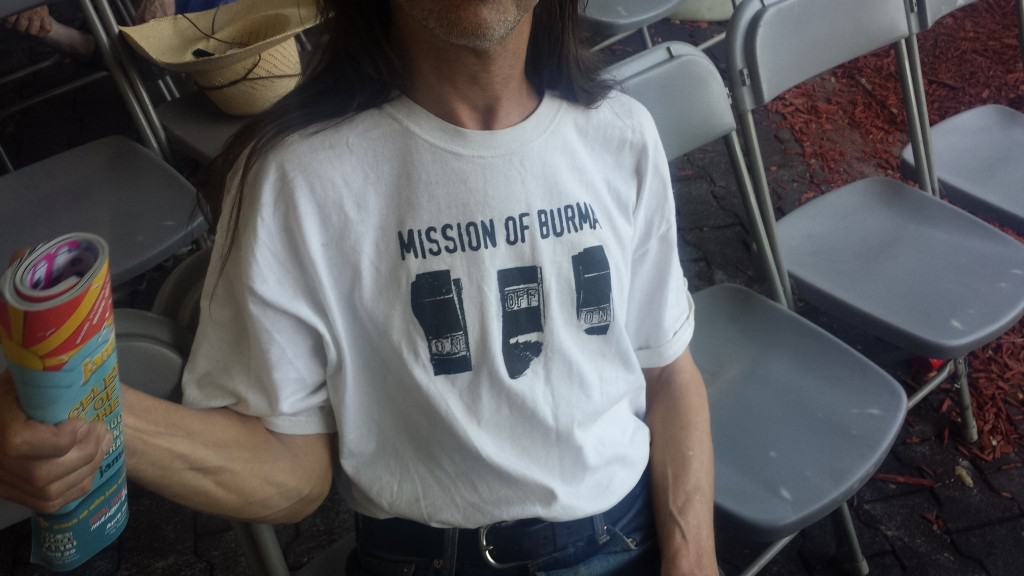
This shirt I saw at Jazz Fest for the early Punk band Mission of Burma is truly vintage, not mock vintage, is simple. There are a whole lot of shirts out there that are new but with a simple vintage look.
Simple and also low contrast.
Simple, distressed, and not bright white.
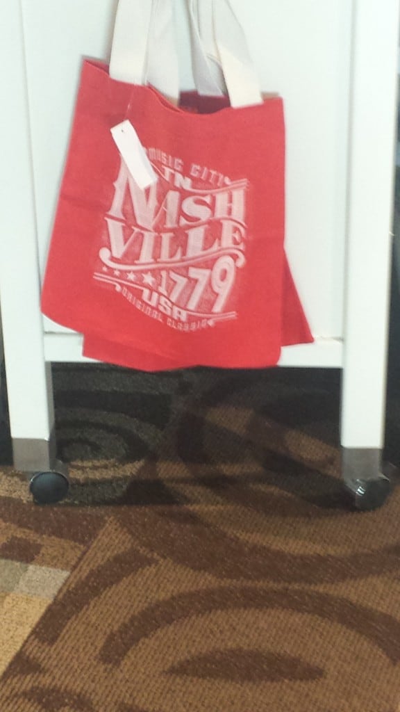
Simple distressed on a tote bag.
Simple and distressed.
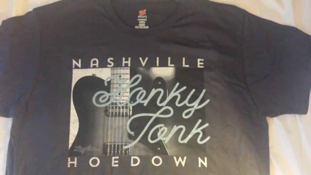
Even our own Ink Kitchen shirt for the Nashville show is low contrast and blends into the shirt.
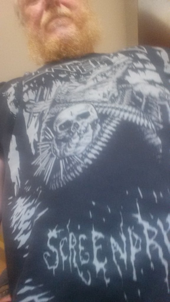
I visited with Brandon of Inferno Screenprint in New Orleans and his great designs and soft printing are doing very well there. This shirt promoting his shop is one color, soft and low contrast.
Black on heather grey, it doesn’t get any simpler than that. Of course not a standard garment. The garment is what is increasingly the more complex aspect of the equation.
Even a joke shirt is here tonal low contrast and on a complex blended fabric, not what you would have seen 10 years ago, when it would have been white ink on an 18 singles open end fabric.
Simple, not exactly complex to (almost) match the sleeves with one color as again it is all about the garment.
In one way a billboard shirt in that it in fairly large letters just a nice garment with the name of the museum. However, it is a muted color and low contrast simple ink choice.
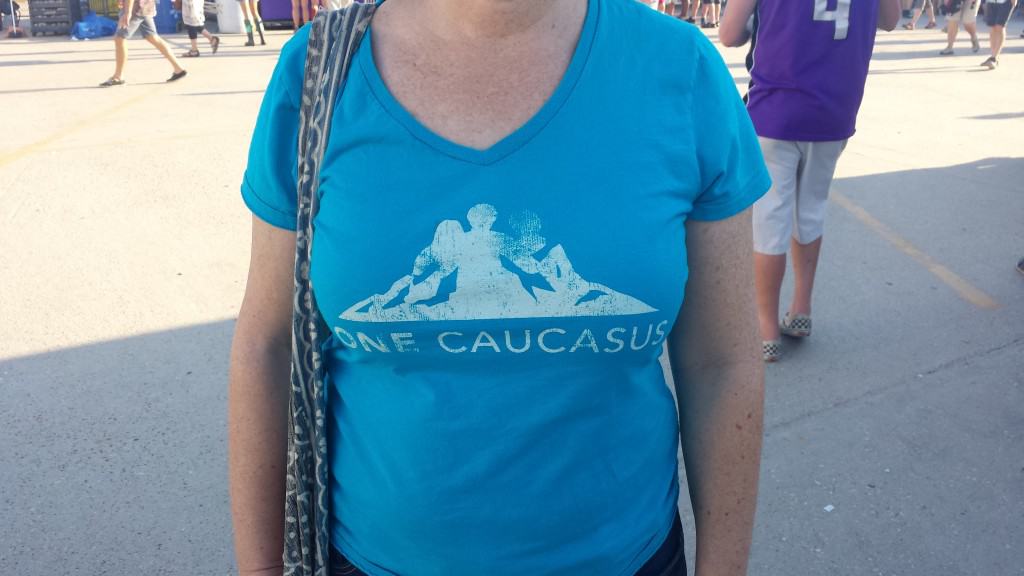
Two colors!!! Still pretty damn simple with colors that don’t even touch. Not the greatest design to go on a v-neck, since it ends up on the belly…
This group of shirts with a Royal Apparel label in them clearly were not from the same dye lot…

Comments