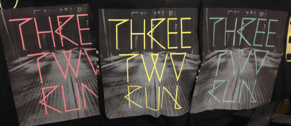
Something different this week
This week, I posted a few experimental prints on Instagram and Facebook (@nototriousrandd) and wanted to pull back the curtain a bit. These weren’t just surface-level graphics—they were reveal prints, engineered to transform under specific triggers: light, heat, and UV. I didn’t dive into new AI techniques this week (thanks for hanging in there as I explore other topics).
Reflective Reveal
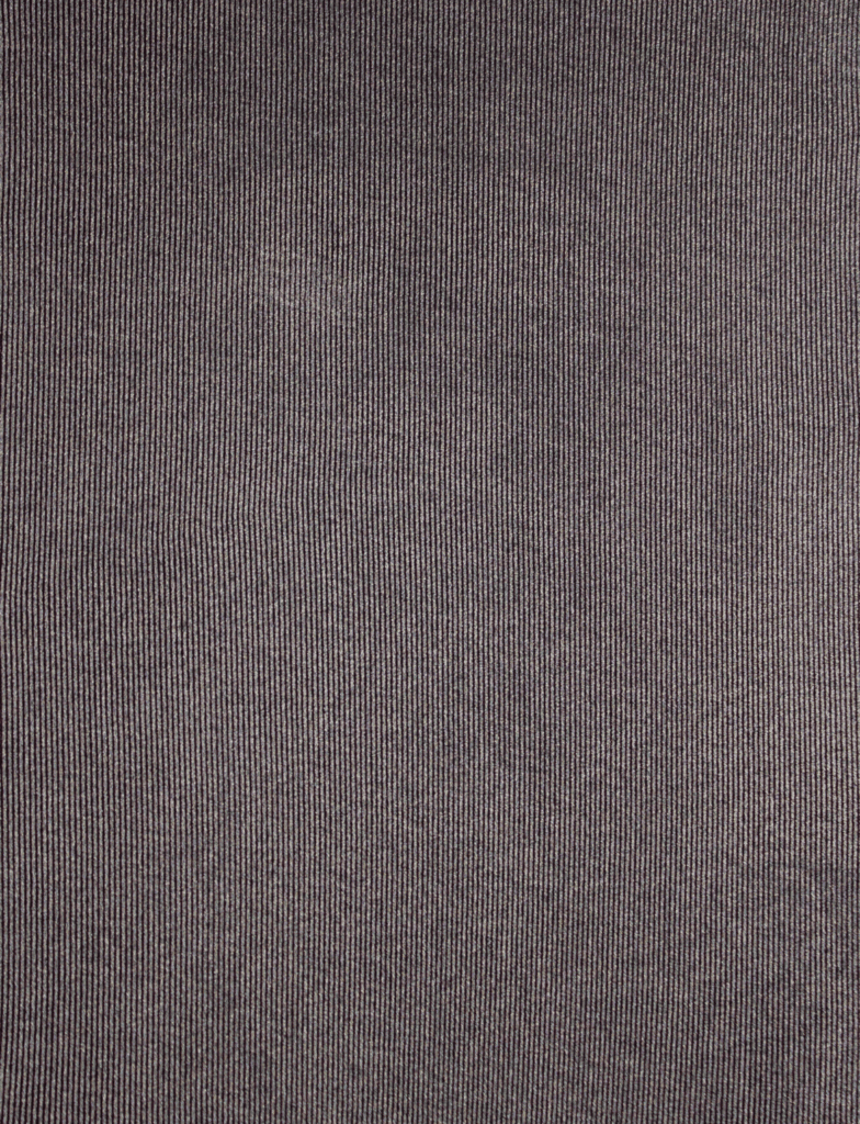
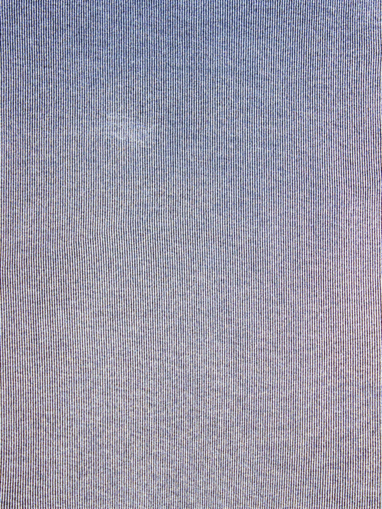
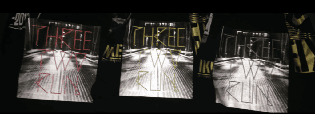
The print that got the biggest response was a reflective reveal. We formulated a flat gray with a touch of metallic to visually blend with reflective under most ambient lighting. The magic came from how we structured the layers. First, we printed the reflective layer as a full lined solid—thin lines, purposefully spaced—so the reflectivity was disguised until triggered by flash. On top of that, we laid down the high-mesh halftone gray, color-matched to the reflective. This overprint used a finer mesh count to sit precisely where needed, masking the reflective until the moment of capture. Reflective inks require a coarser mesh to let the glass beads pass. The result? A surface that appeared flat until hit with a flash—then suddenly lit up. The THREE TWO RUN used shadow blacks (clear with 0.5% black) overlaid on reflective instead of gray, for a similar outcome.
Thermochromic Reveal
Next was a thermochromic print—a heat-reactive design using the exact same layering concept. Again, we worked in hidden visibility, but this time with temperature as the trigger. The design only revealed itself with body heat or applied warmth, making it interactive and personal. Again we matched the top high mesh ink to the cold thermochromic. When matching either the reflective or thermo always do it after printing, through the correct mesh. This is the most time consuming part, but maintains the illusion.
Photochromic Reveal
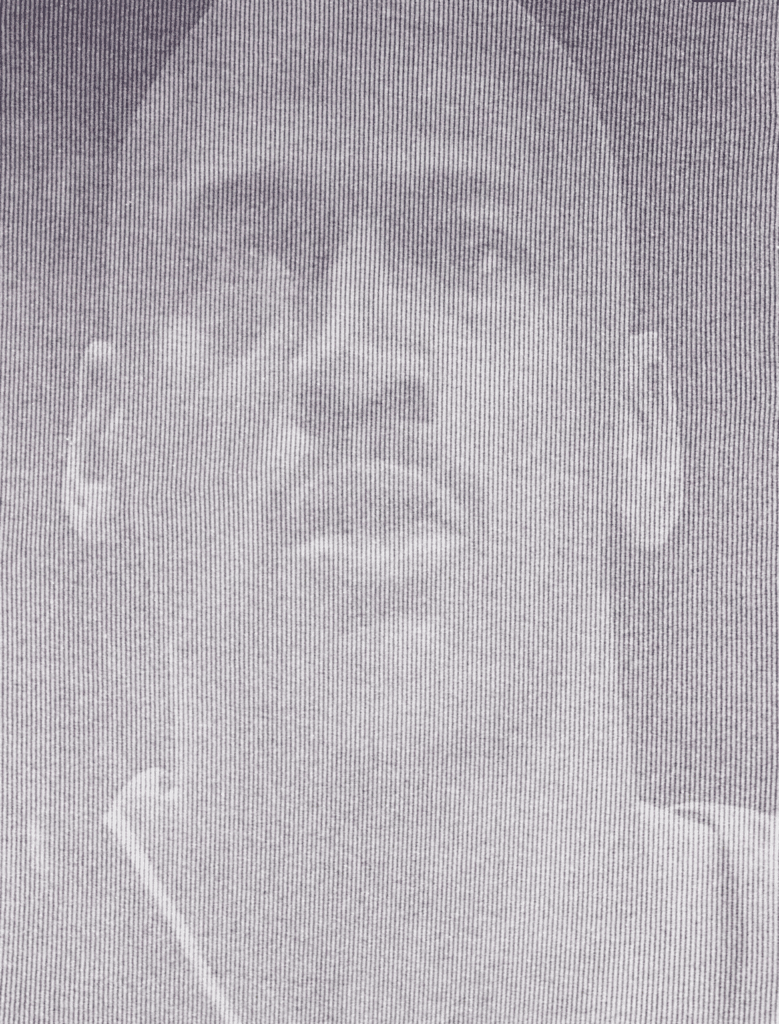
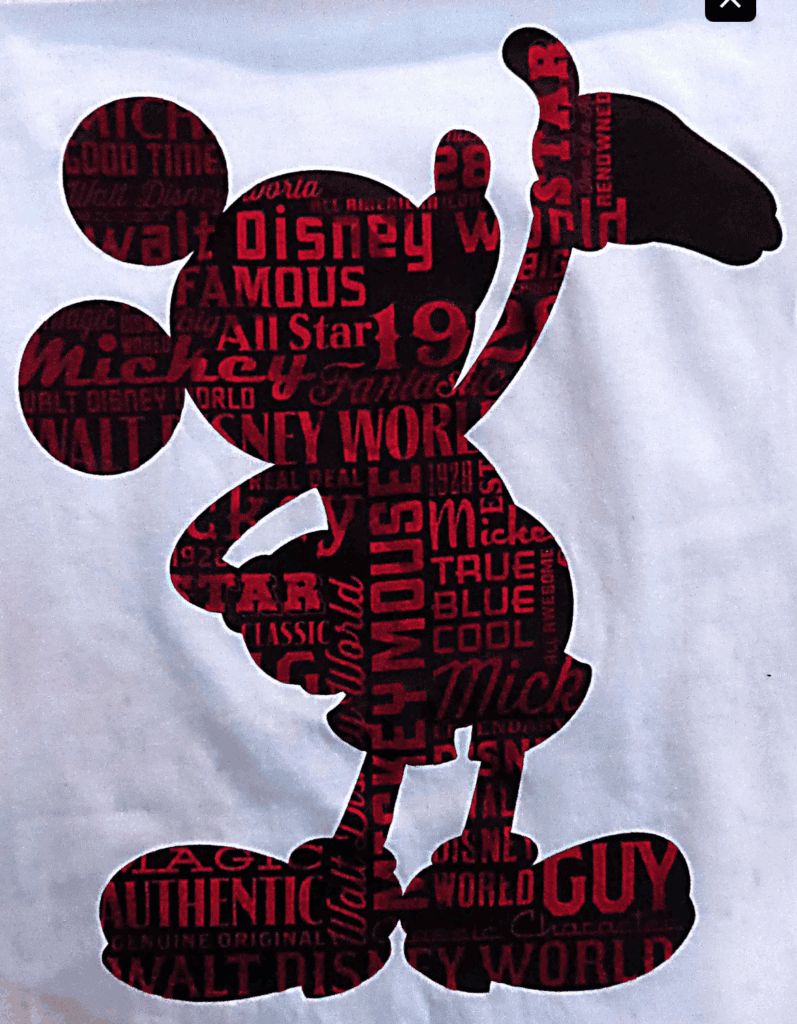
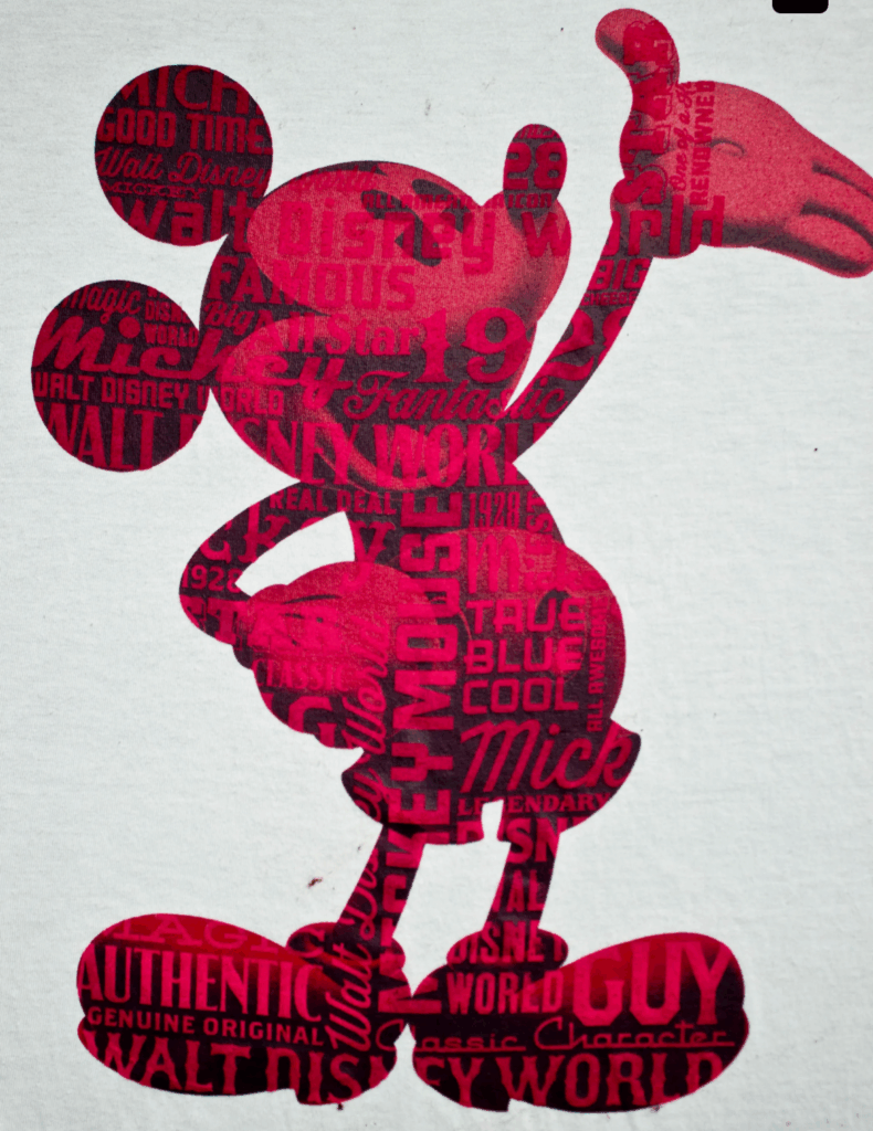
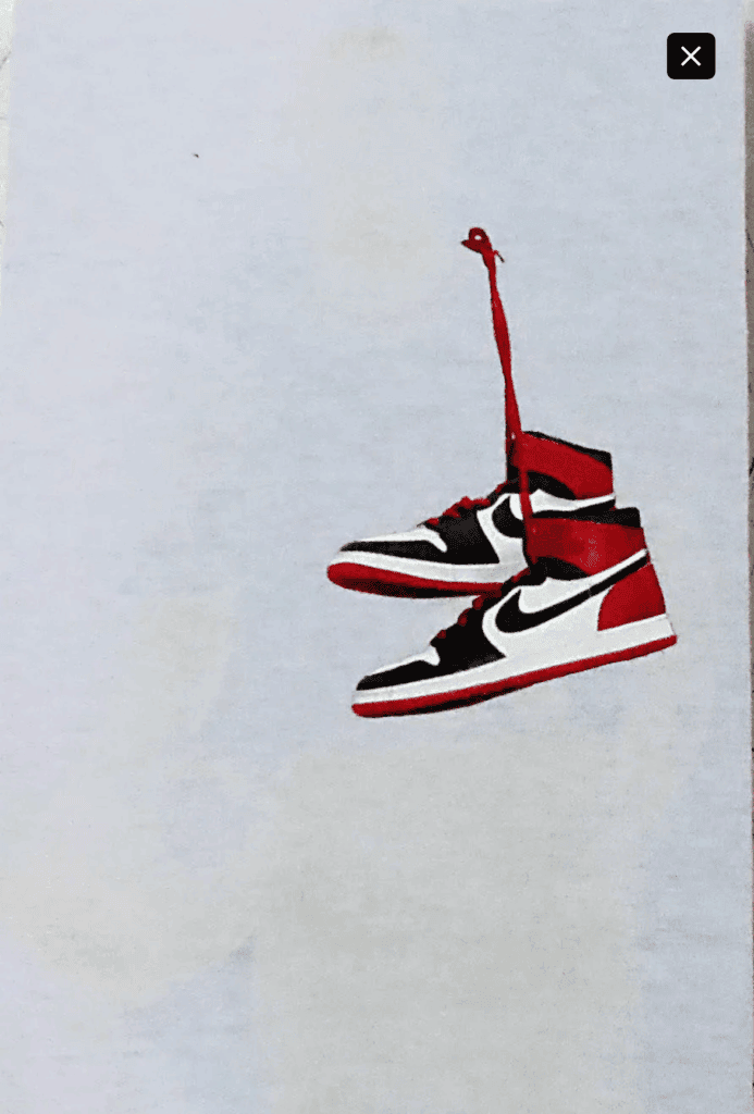
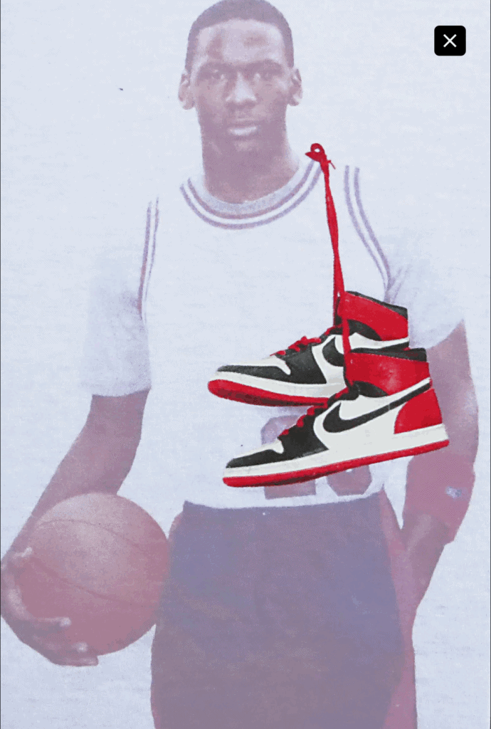
From there, we went deeper into the invisible: photochromic CMYK. We first dialed in a traditional 4CP using standard process inks to get the values and registration perfect. Then we swapped the set for photochromic variants. These inks, as you might guess, remain invisible until exposed to sunlight or UV. Testing was labor-intensive. We used flashlights, UV lightboxes, and yes—walked the prints outside to calibrate. The Jordan piece was tested inside with a controlled lightbox; we also did a Marvel design and we chased daylight. The payoff was subtle and rewarding: a print that emerged under UV.
Environment Reveal
Finally, the Alibi tee pushed it further. We used a pearlescent white as the base, a soft shimmer under normal lighting. Then came a clear reflective elephant pattern (again, only revealed in flash photography) and a laser-etched logo pattern visible under blacklight. All inks were some form of “white,” but with different effects, they overlaid into a kind of optical camouflage. Under typical conditions, the design looked minimalist. Under layered lighting effects? A completely different narrative. Sadly, the brand passed—maybe I got too cheeky with the name.
I was inspired this week after attempting a tried and true print technique that ultimately failed at my development, in its original concept, only to be relabelled and presented as something a little different. I like that space, happy accidents, unintended outcomes. Screenprinting at its best.

Comments