Ah, Pantone, how I despise you and let me count the ways:
- The color guide books are expensive as hell considering how many books they sell and the fact that in our industry and others I presume they also get licensing fees for inks that match their Pantone colors. The cost means that not only do we have to pay a boatload for all the ones we need in our shop, but the high cost means that our customers often don’t spring for the books and we have trouble communicating about color with them.
- The books of colors fade and you have to get new ones. Something they are sure to remind you of. Although to be fair I think they give you a penny off each book for turning in your old books…
- They have exciting new colors every year! Mainly exciting to them because it means you have to have new books if one of your customer picks one of those colors.
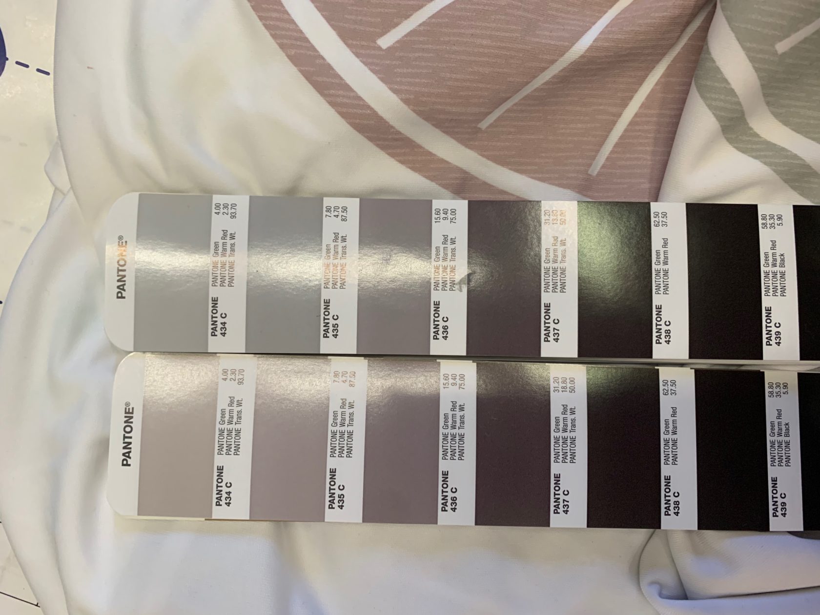
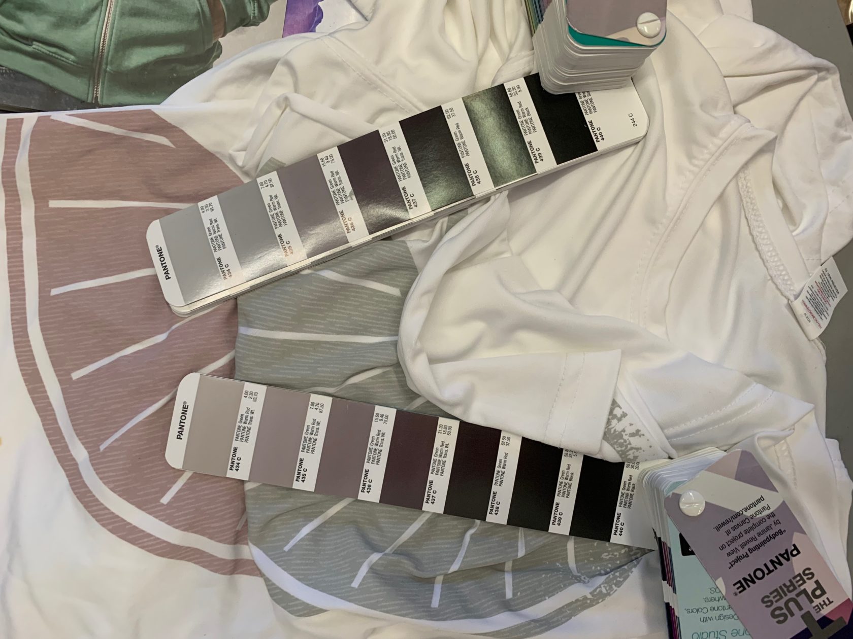
Now comes one I never thought of before. We were printing for an important customer and had a grey to match. The customer saw a photo and said, “that looks kind of pink, I specified a grey.” We sent a photo of the print we did alongside the color in our Pantone book. I”ll cut to the chase here, our book had the grey looking pink and it isn’t pink at all. This was a brand new Pantone book straight out of the box.
This all wasted lots of time and I was angry and asked around. I asked a good friend in the business and he said, “oh yeah, they are very inconsistent, we buy a whole bunch of extra books and throw out the ones that don’t look right.”
We have enough variables in screenprinting, I am sorry to tell y’all that another one is that your Pantone books may not be accurate.
Pantone is a wonderful system to communicate about color. It is just too bad that it really feels like they are taking advantage of us with their monopoly. Toyo had their own color system which I think is defunct, that’s perhaps too bad for us.


The inconsistent color is a new one to me. Thanks for sharing.
Standards ought to be free or low cost. The exorbitant costs from Pantone is a result of a proprietary standard. Perhaps an industry organization should develop a competitive color standard.
and let’s not forget the ink manufacturers delivering the mixing colors that are not consistent. Some of our customers have higher tolerances than the ink manufacturers. . .
[…] I reposted an excellent blog article by Rick Roth from Ink Kitchen on my social media feeds. (Please read Rick’s article!) My repost of that article on LinkedIn […]
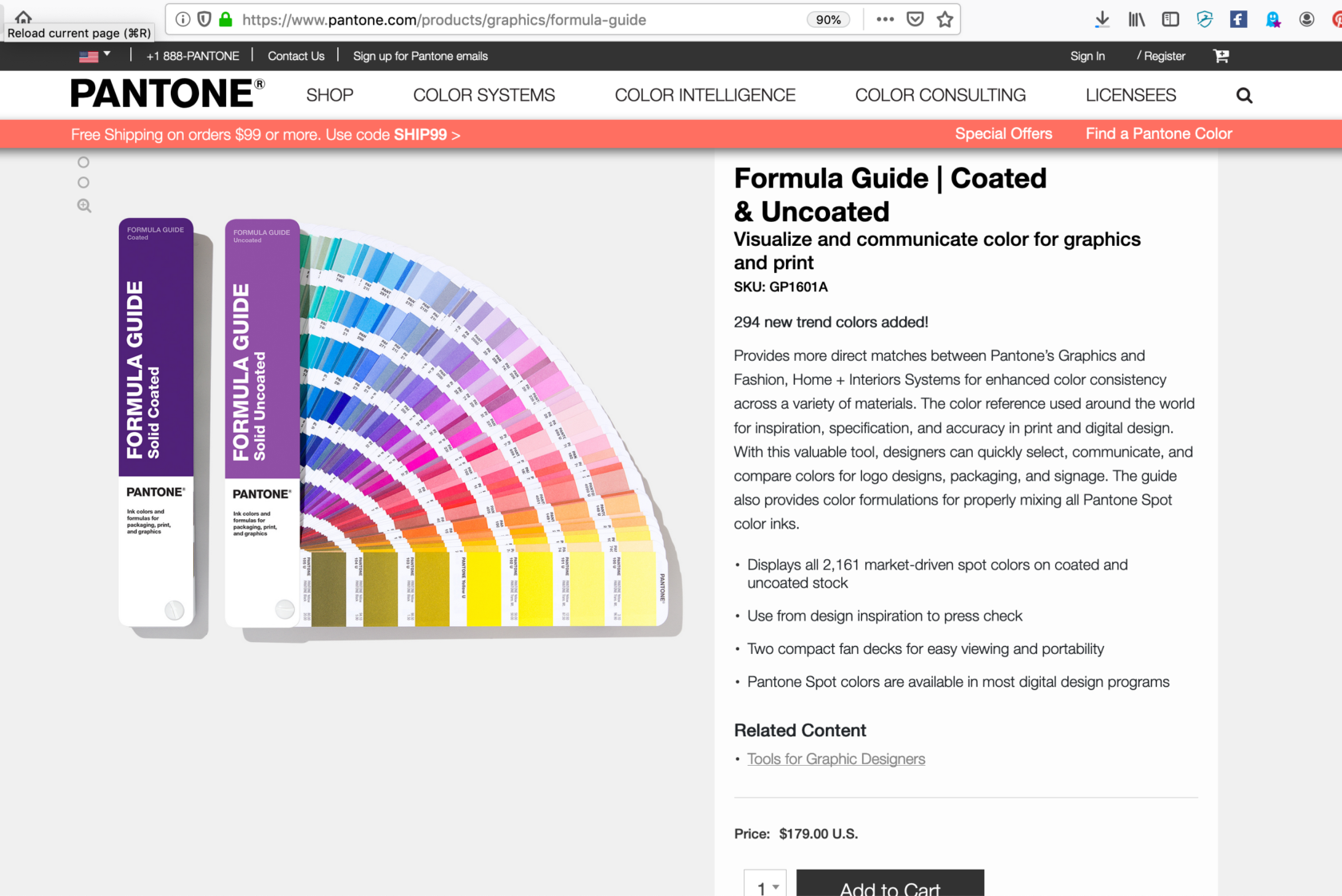
Why do we have to buy Coated and Uncoated as a set? We work only with the coated