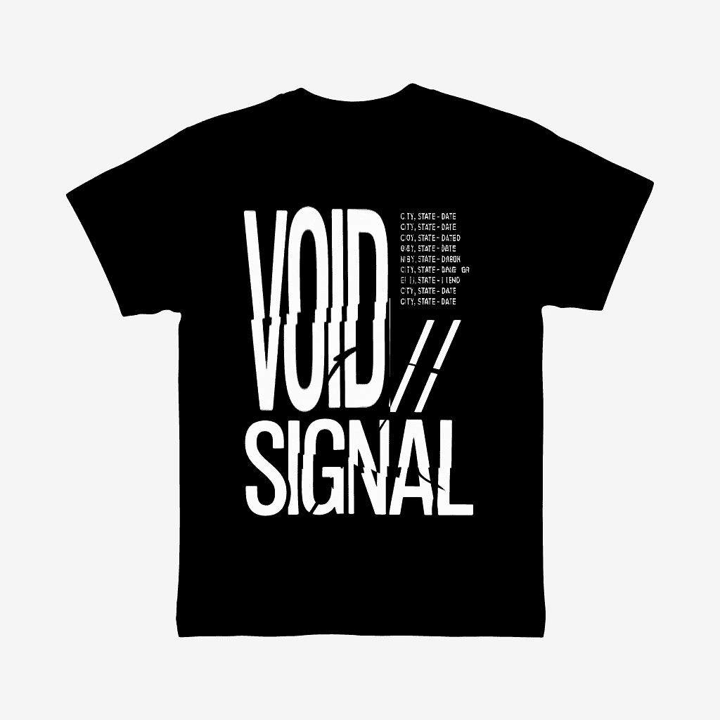
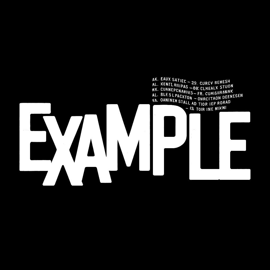
A design measured 14 inches wide by 17 inches tall, featuring two distinct text elements: heavy bold text spanning the full image height in the left area, and fine-detail text positioned on the right side.
The Problem
The original separation placed both text elements on a single spot white plate. This configuration created inherent registration challenges because operators must prioritize one area when aligning the screen. With bold text on one side and fine detail on the other, any adjustment favoring the detailed text causes the other text to blur slightly, and vice versa. The mesh itself cannot simultaneously achieve two conflicting objectives: holding fine detail while depositing heavy ink coverage.
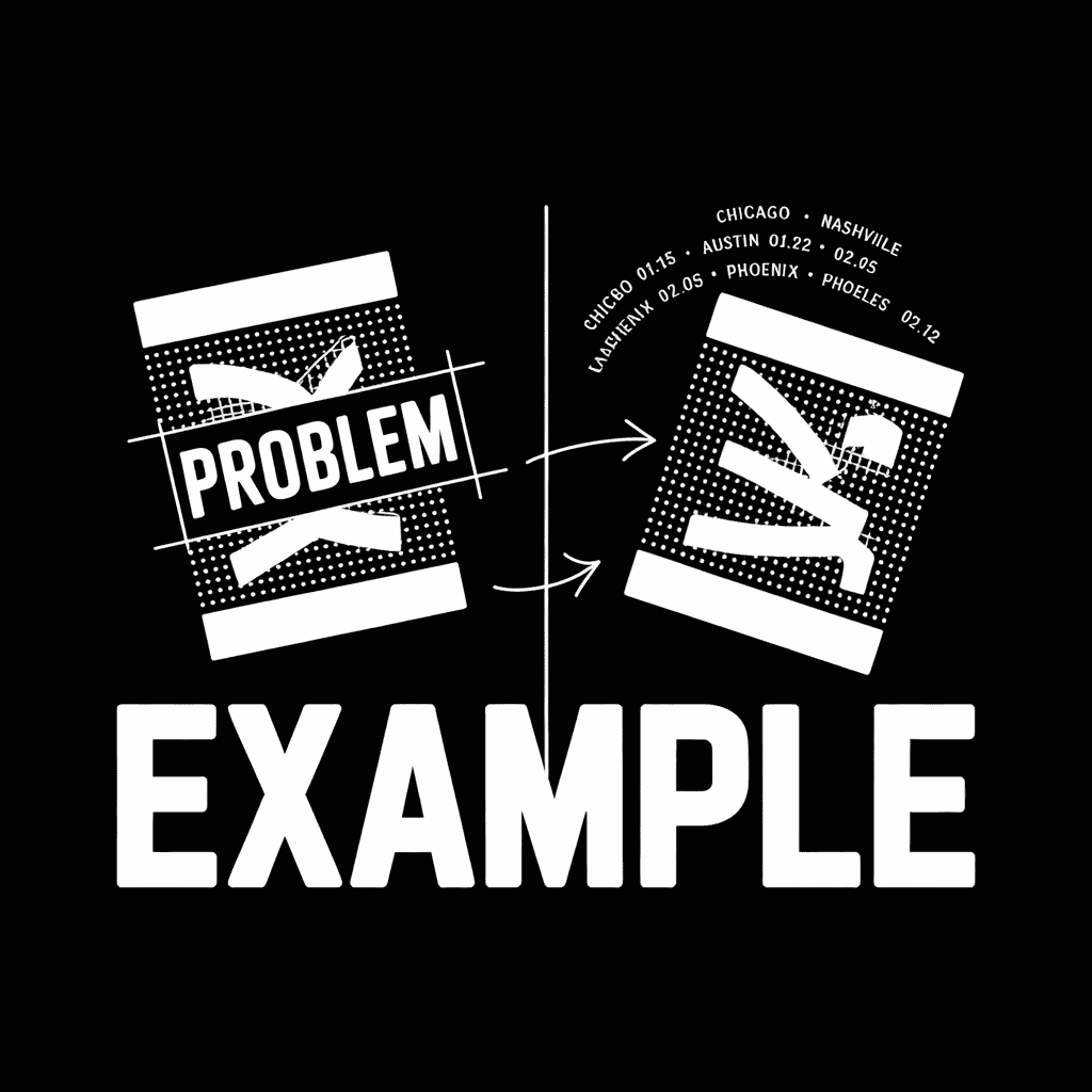
The Solution
A revised separation splits the white into two plates: Spot White for the bold text and Detail White for the fine detail. This approach allows each screen to use appropriate mesh counts, enables independent registration for each element, permits separate squeegee positioning to reduce mesh tension and deformity, and eliminates the compromise operators face when registering conflicting image areas.
Take Away
When vector artwork contains conflicting elements, differing orientations (vertical vs. horizontal), contrasting weights (bold vs. fine), or disparate positions (opposite corners) artists can anticipate the need to split the screen before reaching press. When elements share the same color but conflict in other ways, splitting them onto separate screens produces faster runs, easier registration, and reduced costs through fewer setups and adjustments.


Hello why no images shown? All 3 screen areas are Blank
I can see them on my phone and my browser (both Safari) let me check some other browsers
Hi Don!!!
I don’t know, I can see them on Chrome, Safari, and Atlas