The customer says, ” I sent you the color, why doesn’t it match?”
and then it starts…
Here are probably not all, but many of the reasons color matching for screen printed t-shirts is so difficult.
Customer’s Dream and Aspirations for the Color
1. We have customers that send us computer images and expect t-shirts to look like that. Computer images are backlit and bright and made of thousands of pixels, t-shirts are not. I know you can do all kinds of complicated things to make your monitor closer to what print results are, but that doesn’t work for your customer and the thirteen different people on their team that see the image on their home computer screens. Repeating for emphasis, they are never going to look the same.

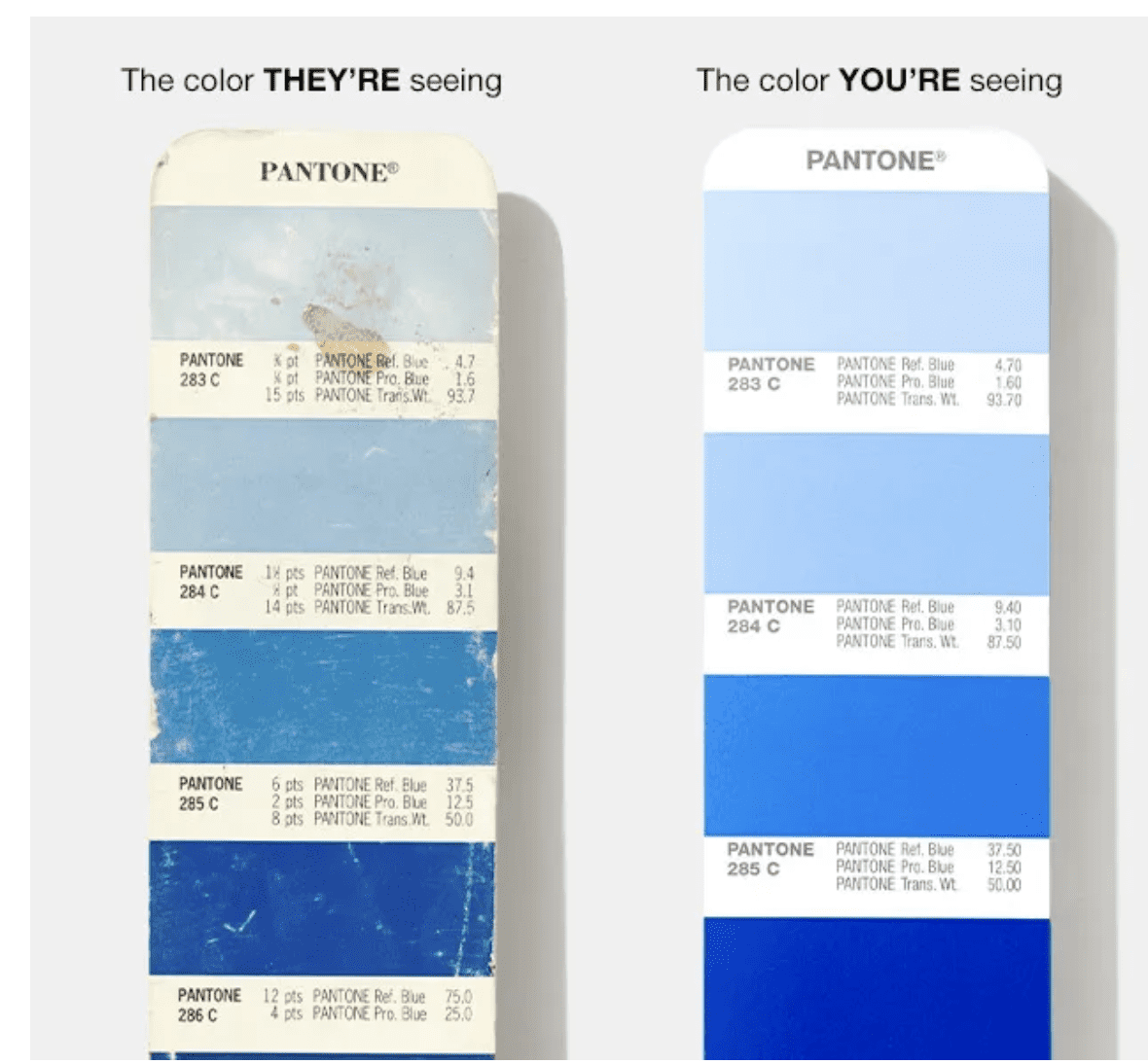
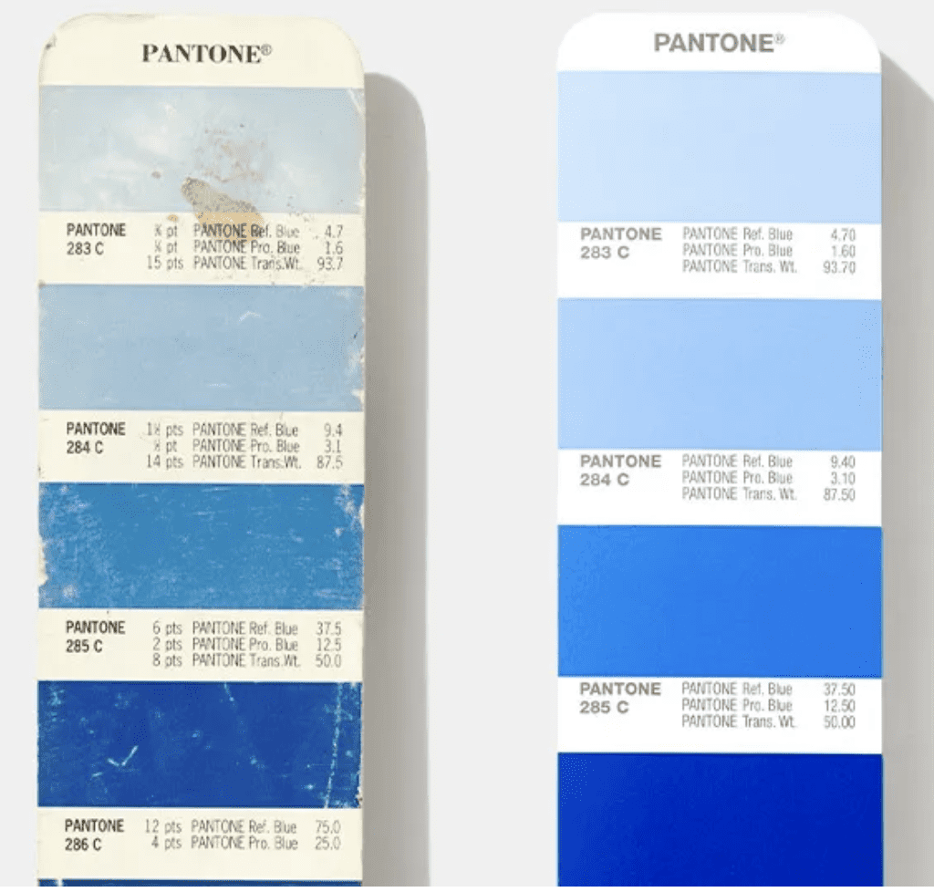
2. Customers that do look at a Pantone book may have one that is faded. Pantone books fade sometimes in months, certainly they do in years and they sometimes come with colors that are wrong. An ink company that bought lots of them told me they had to reject about 5% of them as having colors that were wrong right out of the box.
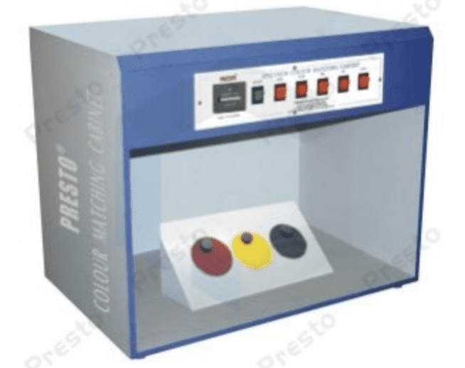
3. Customers may look at that Pantone book in light that is not the same light as we are looking at. Some folks use a light box that controls the temperature of the light source and then the printer does as well. This has only a passing similarity to what the color will look like in the real world of a mix of artificial and natural light and is a good expensive way to settle lawsuits about color matching, but usually a waste of time and money for making nice t-shirts.
4. Sometimes customers don’t send us Pantone colors, we are told to match a painting, or the ink on the front should match the sleeve color, or in real fun times a shirt that was printed ten years ago by some other printer who used a different ink system and the shirt was then washed many times. A healthy human eye has three types of cone cells, each of which can register about 100 different colour shades, therefore most researchers ballpark the number of colours we can distinguish at around a cool million. (Though there are some rare women with the ability to see a hundred million colors or more.) A Pantone book of coated colors has 2,139 colors. You might see here why we at least ask for a Pantone color.
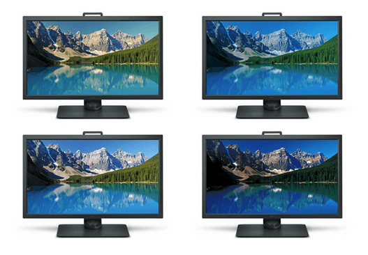
5. Most customers do supply a Pantone color and then we have the issue of how good is the customer’s monitor and how is it calibrated? Ever walk into a big retailer to buy a TV or computer and look around the showroom? None of the screens match. People take those home and they continue to not match each other’s or ours.
6. People love their phones and the freedom it gives them. However, the phone gives them the freedom to look at our mockups and they think they can approve ink colors and photos of strike offs, and so they do. They are literally looking sometimes at a t-shirt image that is a half inch in size and they are telling us the color looks too red or to print it a half inch higher on the shirt.

The Shop Tries to Match the Customer’s Dreams about the Color
So somehow we get the color information, which on a good day resembles what the customer wants. We then have to mix that color and apply it to the shirt.
1. We use a Pantone book. It may as mentioned above be wrong when we get it. In our shop we buy a bunch, compare them and return bad ones. We buy new ones about annually, and many people at $90+ a whack cannot afford to do that.
2. The books fade, inevitably, we work in a production environment, not a laboratory. $175 per set of books and everyone in the shop needs one close by, and you can see why they are not brand new every day. Even Pantone on their own website says these about the books and why they are not accurate and need to be constantly replaced. Here it is in their own words.
- Handling = smearing and removing pigment from natural oils on fingertips
- Pages rubbing together = scratching or removing pigment
- Light exposure = fading
- Paper aging = yellowing effects
- Ambient moisture = accelerated paper aging
- Natural pigment expiration = faster, noticeable color variation, especially in lighter and pastel colors
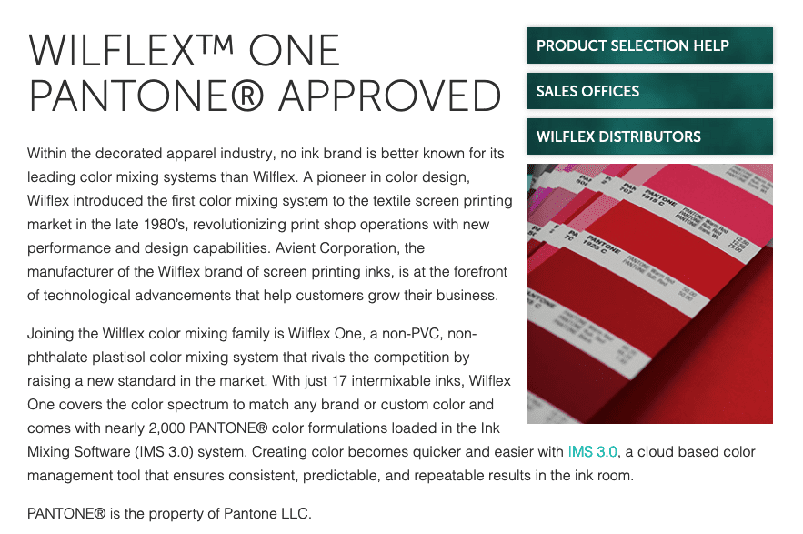
3. We use formulas created by the ink company. We use mostly Avient inks and they pay a hefty fee to Pantone and make licensed formulas. Some companies don’t actually have those licenses or don’t work hard on their formulas. Avient is pretty damn good at giving your formulas that match Pantone colors, but not perfect. Some ink companies do not do such a great job, so good luck.
4. Raw materials can change in availability and building colors from new ingredients can cause issues with inks that use very small amounts or when subject to heat.
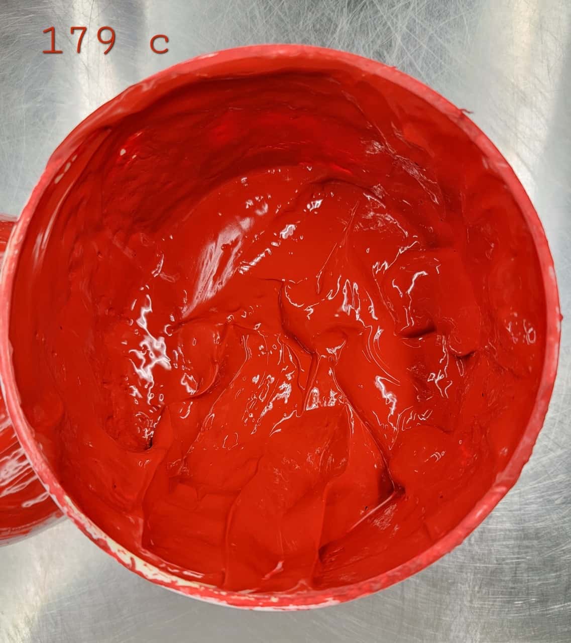
5. The printer does not want to mix any more ink than necessary. Ink can cost up to $150 per gallon or more. Printers use some stock colors and use up ink from past jobs when possible, but they don’t have 2,139 Pantones on the shelf. If it is discharge ink, you have to use it within about six hours or usually throw it out. Most printers have expensive accurate scales, but those are only good to a certain tolerance, so the less ink one mixes, the more possibility of variation. So the amount the printer wants to mix and the ideal amount for accuracy are at cross purposes.
5. The printer goes by the formula. Then the printer looks at the ink in the bucket and checks that. In the bucket is not necessarily what it will look like on a shirt, in fact, usually not.
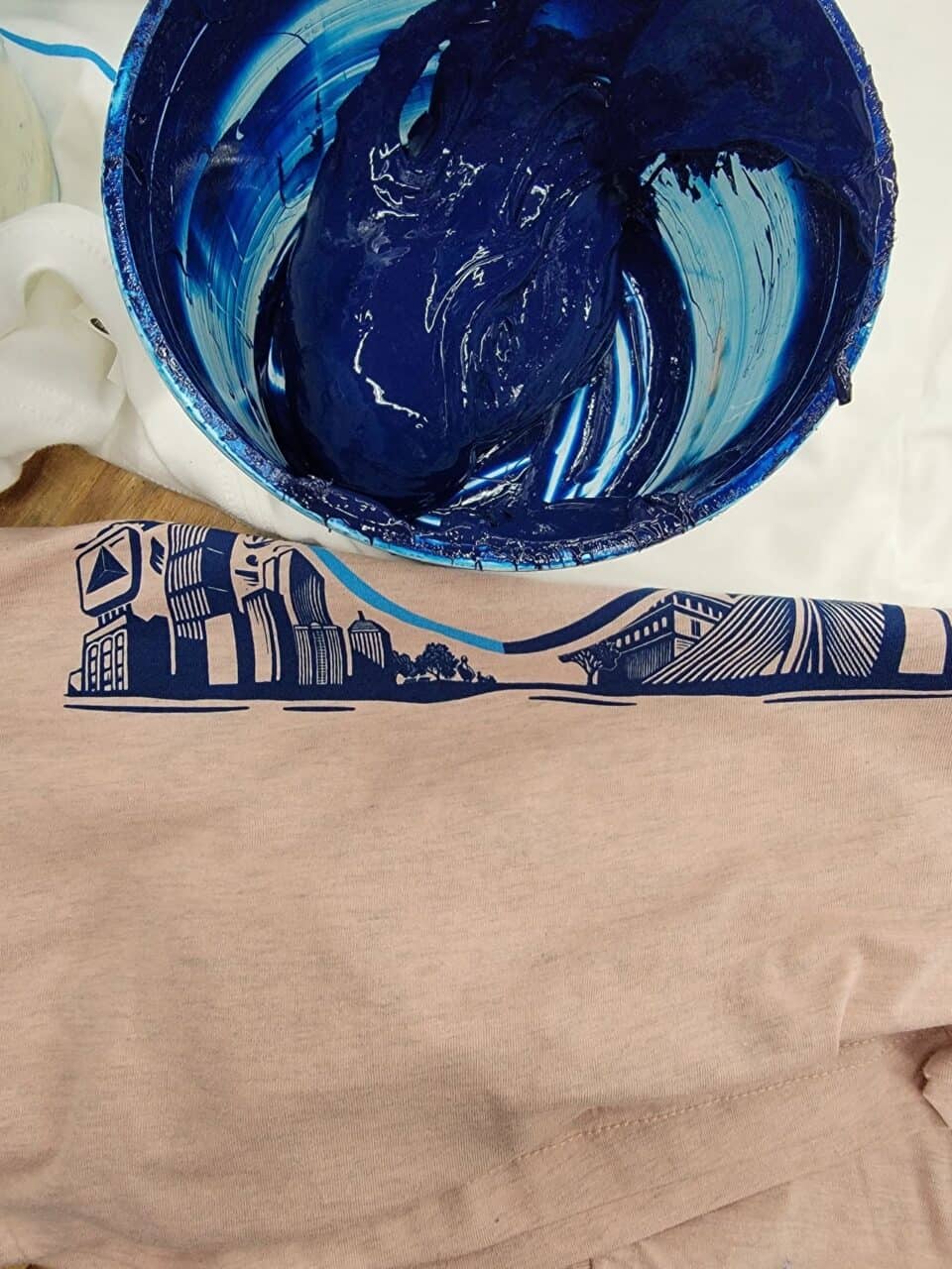
6. A good printer then usually swabs some ink on a shirt because a thinner amount of ink doesn’t look the same as the ink looks in the bucket. Again, we are getting closer, but it is not the same as the ink will look on the finished product.
7. Then the printer prints the ink. Most inks are translucent and so the thickness of the ink film greatly affects the color that you see. This is worthy of hundreds of other posts about how the factors in the following list affect the thickness and surface of the ink film and therefore they affect the color:
humidity
ambient temperature in the room
temperature of the platens
flood stroke
squeegee speed
squeegee pressure
squeegee angle
squeegee durometer (how hard or soft and how pliable)
mesh count
type of thread in the mesh
emulsion thickness
off contact distance
thickness of the garment (which affects off-contact distance)
the shirt including how absorbent, how flat, how fibrous, and any chemicals on the surface, and the type of dyes used
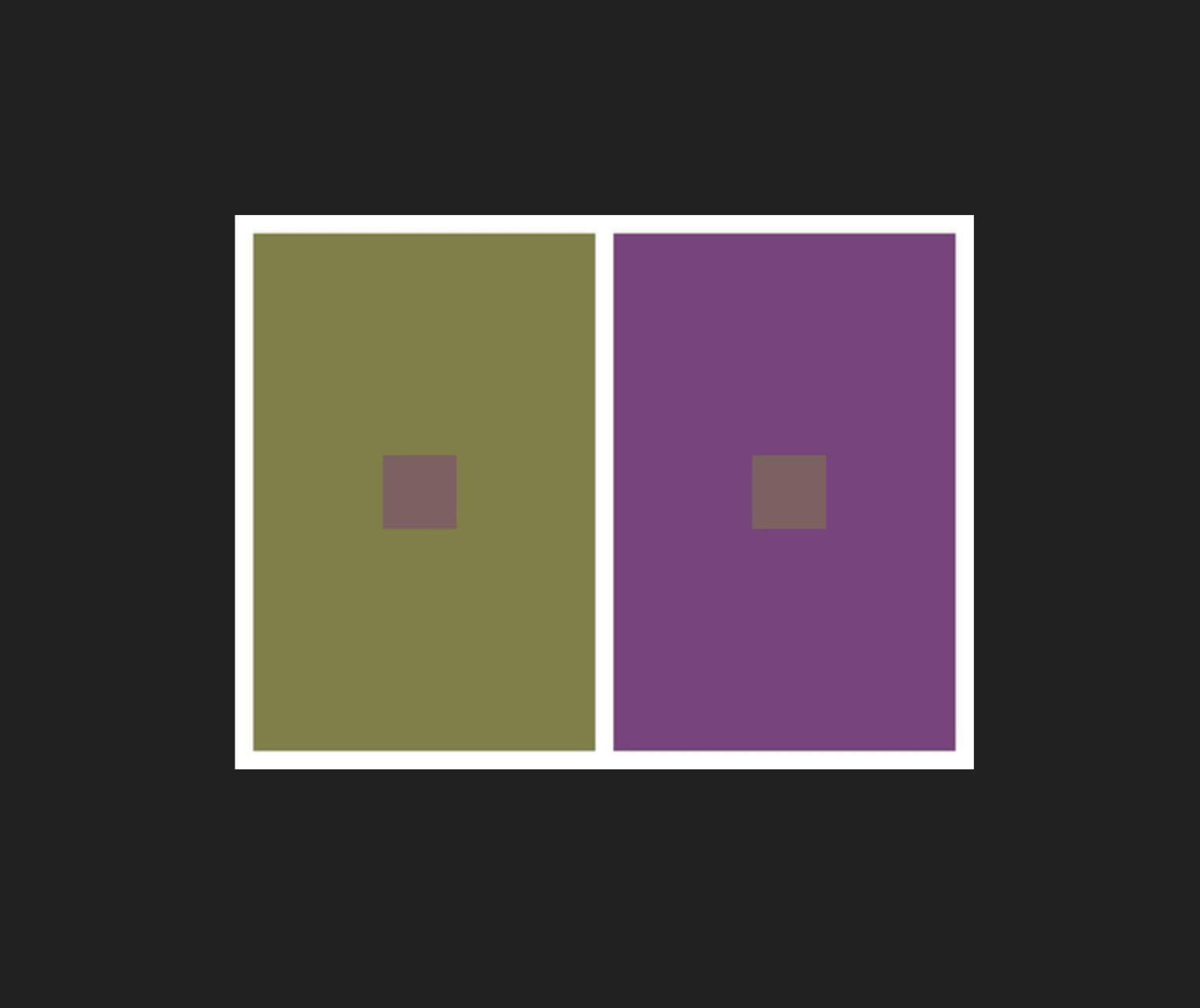
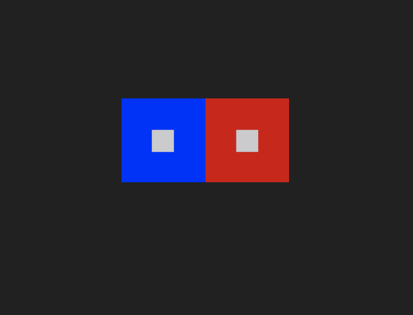
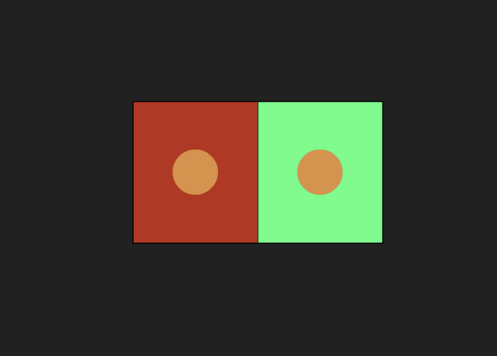
8. Metamerism is a physical reaction your eyes have to colors and has to do with the dynamics of your rods and cones in your eyes. How this plays out is that the color you saw in the bucket and even in the screen may look different on the shirt background and next to the other colors you are printing.

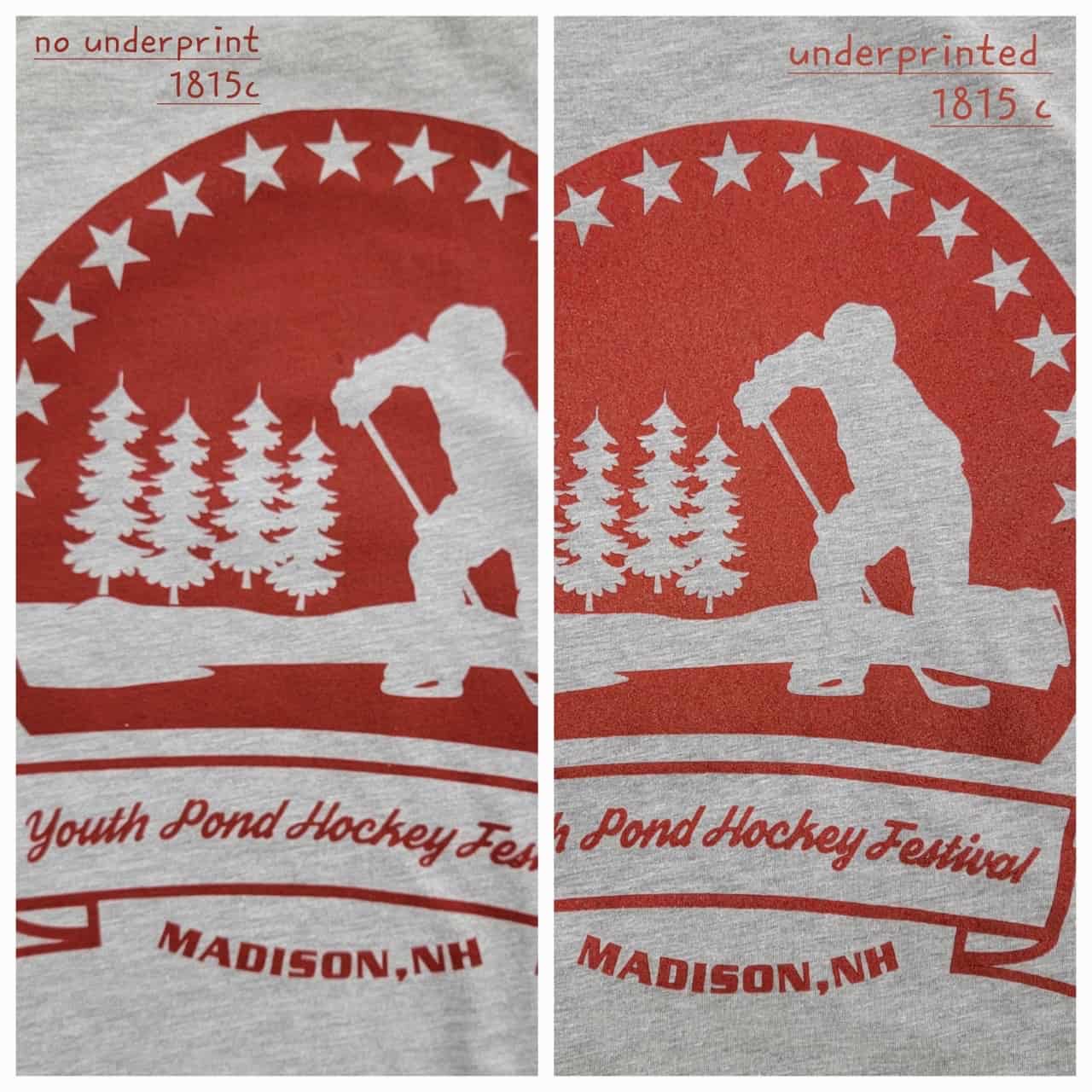
9. Underprinting a white is how you print plastisol (most common) or acrylic ink colors on dark shirts. Since the inks are translucent you are now either getting the effect of the smooth white underprint, or you are getting a bit of the color of the shirt coming through (so for example red ink on a pale yellow shirt you don’t use an underprint but there will be a slight tonal change in that red toward orange.) The difference of printing plastisol ink on a white shirt or over a white underprint is so substantial that you actually need a different ink formula in many cases in order to get the same end color result. However, we are not given these formulas because they just are not that accurate and the ink companies don’t want to be liable or to confuse people so either we on the sly beg for the formulas or come up with them ourselves, or we usually just despair and have the customer live with the differing results.
So you think you might have an advantage with discharge inks because they don’t use and underprint? No, they are actually worse to color match. Shirts don’t all discharge the same. Colors made with certain dyes will not discharge at all. Other shirt colors all discharge to varying degree, from almost bright white, to varying greys and off-whites, to slightly the color of the shirt, to even weird colors you don’t expect (for example black shirts might discharge to a yellow color sometimes.) So the base color of the shirt will then affect the ink color. To make matters worse the heat, humidity, and pot life (how the ink changes over time in the bucket or screen) also affect the color of discharge. Add in the fact that shirts nowadays might be made at different times and even in different countries and therefore with different dye formulations or different finishes to make the same colors and therefore may discharge differently. So discharge color matching is its own special hell of which this is only the first level of hell, we’ll get to more shortly…
10. So you can look at what the color looks like printed. However, to really know the color you have to be printing for a number of pieces. As you print the flash cure units affect the platen temperature which affects the ink. Also without getting too technical, ink is thick and when you start moving the ink back and forth in the course of printing it, the ink gets thinner and that affects the ink film and therefore the color. You can pre-mix (pre-stir) the ink to get rid of some of that, but it is still a factor. Basically you can make a perfect color match on a sample and at production speeds the color can change.
11. There is factor called “dot gain.” Basically the emulsion on the screen has to be broken in to get the final results. As you begin to print, a combination of the aforementioned ink thinning and the stencil breaking down ever so slightly on a micro level means that halftones will become bigger and therefore affect the color. To a lesser extent even line art can change as the stencil allows a bit more ink through as the printing starts.
12. At this point you have the wet ink on the shirt and you might think you can see if you have matched the color correctly. Besides the aforementioned lighting problem, the ink will change when it is heated to be dried (cured.) In the case of discharge it just looks like a wet shirt with a little color since it will not “discharge” until heated in the dryer. In the case of plastisol and acrylic, it can change color when heated in the dryer.
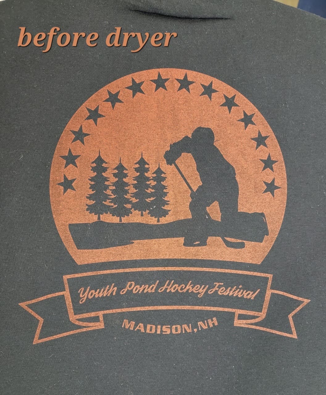
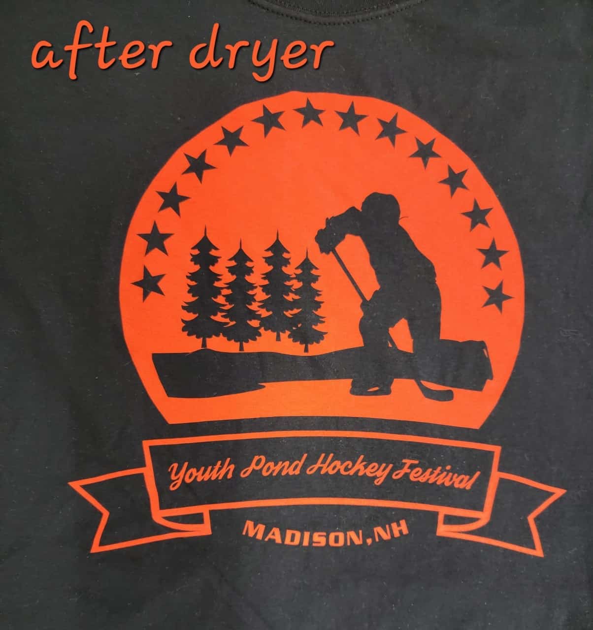
13. So you think at the end of the dryer your color matching work is done? Sorry, no. There still is the lighting issue, don’t forget about that. There are several issues at this point. For plastisol, the ink color can change when heated and also the shirt color, usually temporarily. The color may look different for a few minutes, an hour, or in extreme cases even until the next day. What fun. In the case of discharge ink, this is the first real chance you get to see what the ink color is mostly going to look like in the end.
Evaluating the Final Result
1. So the printer finally makes it through all that and now you have the lighting issue. You also often have the communication issue and this has a variety of components. You have to decide if the color is close enough to pass, because the definition of a perfect color match? The only definition I know is that the customer pays you for the job. There are no industry standards. There is great difficulty in negotiating how much off from perfection you can be (is a half step in the Pantone book still acceptable?)
2. You might try and send a physical sample to a customer. That has issues of sometimes prohibitive cost and also of the printer later matching the exact sample results on a different day for production on a day that might have different humidity and temperature.
– You might try taking a photo to show the customer. Phones do not perfectly reproduce color, in general I find they make things more rosy. There is also the lighting on the shirt (yes, again…) Well, whatever the reason, the colors may not be entirely accurate, even looking through the viewfinder of the camera on your phone. Then once you send the photo, what monitor or heaven forbid, what does it look like on the customer’s phone.
– If you are deciding in the shop? That mock up the customer saw might for a variety of possible reasons not really represent very well what the shirt color is, in real life particularly heathered shirts can look very different than their mock counterparts. Spend some time looking at actual light and dark heather shirts in real life and in photos and in artist mock ups to see that mock ups and real shirts are not entirely aligned.
When you look at all the pitfalls in this process, you can see why color matching is so damn difficult. In the end the judgement in the end of whether a color adequately matches will be whether the customer pays you. And by the way, you better keep very good records of how you mixed the color and how you printed the color so you can match this color again.
Love this detailed “schooling” especially for decoration newbies and potential customers you might have. (printers, customers etc. with less than 6 years experience)
Decorator businesses need to have a broken down “variables” disclosure for ink color matching in the forefront of documentation and not in the super fine print.
I love this. Well done and spot on 😉
Nicely explained. Great article.
In my experience, I have seen Pantone change papers which can also contribute to mismatch