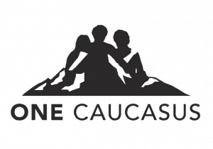
Blog Page 98

Mike T – More Shirt Illustration. Less is More.

As our previous posts (Web Wednesday–Mike Thompson, How to Illustrate for Shirts) indicate, Mike T is the master of t-shirt illustration. Here are two more from his canon: Jam Master Jay – great use of the black shirt to blend the illustration into the background. Tupac – Limited color palette but still getting the job…

T-shirt Illustration – This illustrates How to Illustrate for T-shirts

Mike T is not just a great artist, he has done some of the most exemplary illustrations for t-shirts that I have ever seen. This print of Biggie is also one of our best screenprints, but it all started with great artwork. The piece is so good that a marketing company put this in Digital…

Throwback Thursday – The First “Distressed Shirt?

In 1995 (I think, maybe earlier) we worked with Rykodisc to do a promotional shirt for a re-release of the Frank Zappa album “Lumpy Gravy.” On the cover of Lumpy Gravy Frank Zappa is wearing a shirt that is printed with the simple lettering “PIPCO.”   We were asked to reproduce the shirt as exactly…

Web Wednesday–Mike Thompson

When it comes to illustration especially on wearables, there are two things that truly separate the elite from everyone else–composition and execution. In the early 2000’s I had the privilege of working with someone who is a master at both, Mike Thompson. Mike headed up the tee shirt division of Ecko Unlimited and I was…

I Heart Custom Packaging

I love custom packaging projects for a few reasons: It’s a source of revenue that does not require huge capital investment Each project is a unique challenge I love to see the creativity inspired within our team when handling such challenges Today we did a packaging project on a self promo piece which is part…

Misprint Monday – Repurposing in Style

All misprints are not created equal. The lovely and talented Vivian Shibata, who runs the Amnesty International merchandise program, took a shirt with a slight defect and turned it into an ensemble at the recent AI Human Rights Conference. A few deft cuts and some stitching and she turned a regular crewneck shirt into her…

Impresión De Estilo Desgastado

Pienso que la impresión de estilo desgastado no se puede considerar una moda. Cuando algo se mantiene el tiempo suficiente se convierte en un standard. Al pensar en esto traté de recordar la primera vez que ví algo impreso en ese estilo. Recuerdo que Gap y Old Navy lo hacían a mediados y finales de…

Positively Posicharge

When our buddy Mark Bailey of Sanmar first mentioned that they would be releasing a new performance fabric known as Posicharge which would eliminate the need for low-bleed inks, I was dubious.  A couple of weeks ago we had a chance to work with this product in production.  IT WORKS! Sanmar produced a nice little video…

Distressed Won’t Die

I think that “distressed” printing can no longer be considered a fad.  When something sticks long enough it becomes a standard.  Upon thinking about this I tried to remember the first time I came across a distressed print.  I remember Gap and Old Navy doing a lot in the mid to late ’90’s, but I’m…

Throwback Thursday– Mavericks and Such

Twelve years ago in March I was labeled a “Maverick” by Counselor Magazine. Interestingly, my partner in crime here at the Ink Kitchen Tom Davenport was named as one of the 25 Hottest Movers and Shakers in the industry in April of this year by that same Counselor magazine. Here’s the Counselor piece about Tom http://www.asipublications.com/counselor/Awards/content.aspx?id=1218…

No more pages to load