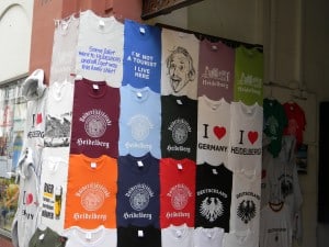
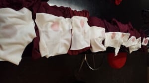
Blog Page 101

Tea Time?

An emulsion bucket that is a bit like a teapot? Hey, I sometimes like the little innovations better than the big ones. You can pour the emulsion better–more smoothly, with less mess, and you can also do it with only one hand. Having the bucket close to the scoop coater and pouring it slowly and…

ISS Atlantic City Day 1

Come see us at booth 1322 at the ISS Atlantic City show today, tomorrow and Sunday. We’ll answer your screen printing questions and tell you the best places to eat in AC.

TBT – Organic Man Redux

For Throwback Thursday, thoughts go to this photo of Stefan Bergill, organic man. It is baseball Spring Training time, Earth Day is coming up and there he is. The interview is as relevant as when I first did it. I have known Stefan Bergill since lived out West and he ran Patagonia’s Beneficial T’s program.…

Web Wednesday: Arsenal

The Arsenal may very well be a designer/printer’s best friend.  It’s chock-full of templates, filters, vectors, even business resources (plenty of freebies too).  Best, it’s all quality stuff presented tastefully.  Whether you are doing design or production art, their products will you augment your work.    

Warning! (in eight languages)

        If you’re getting into printing for retail brands you’ll no doubt find that finishing and packaging requirements are part of the game.  This of course includes fold and poly-bag service.  As a standard, brands and retail outlets will require that poly-bags are printed with an eight-language warning label.  It’s one small…

Misprint Monday: An Outsourcing Nightmare

Many years ago this design came our way as part of a program we are running for a retail line.  We told the customer that this was a print more suitable for a belt printer as the graphic ran from the garment body and over the sleeve with a bleed of the edge of the…

Domingo Gigante– El Problema del Cuello de Pico

Imprimir sobre el cuello de una camiseta de cuello de pico puede ser problemático, “trouble” como dice la camiseta. Un diseño ideal seria uno de cobertura baja o moderada, con medios tonos,  de aspecto desgastado sobre una prenda ligera de cuello a la caja. En este caso el usar District DT161  marca la diferencia al…

V-Neck Trouble

Printing off the collar on a v-neck tee can be, as this graphic reads, “trouble”.  An ideal graphic, ie: low to moderate coverage, halftone, or distressed, a lightweight garment with a flat collar (in this case District DT161 makes all the difference as does a low viscosity ink (in this case Rutland chino base with…

Working Class Pontificator

Pierre Jamnicky owns Blue Moon Promotional in Ohio. He is also one of the founders of theshirtboard.com  He is a pretty serious dude, but with a sense of humor. He is a nice guy with a whole lot of interesting opinions, who works as hard as anybody.  He has started a slew of businesses, and one gets…

Throw Way Way Back Thursday

This screen is the first frame I made for the first commercial job I ever did, for Ken Brown Designs.  The image is from an ad from an old joke catalog, for some weird ass face paint. I exposed the image with a 150 watt light bulb and a pie plate reflector. Instead of a…

No more pages to load