
ink Page 7

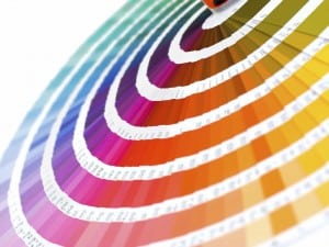
TBT – Roses are still red… Color traps.

This post from a five years ago still rings true. The other day somebody was talking about “teal” as a color which can be everything from a bright blue to a very green blue. Here’s about colors that can be a trap if you are not careful. We are reminded today of the wonders of the…

Boost Your Skills With Silicones

Like it or not, the ability to print with silicone ink is going to have to find its place in your tool box. The pros are: it’s super stretchy zero dye migration on polyesters it’s cheaper than an insurance policy when you need to print on a $150 stretchy polyester jacket. The cons are: short pot…

Throwback Thursday – The First “Distressed Shirt?

In 1995 (I think, maybe earlier) we worked with Rykodisc to do a promotional shirt for a re-release of the Frank Zappa album “Lumpy Gravy.” On the cover of Lumpy Gravy Frank Zappa is wearing a shirt that is printed with the simple lettering “PIPCO.”   We were asked to reproduce the shirt as exactly…

Resurfacing

Print Resurfacing is one of my favorite techniques.  A variety of effects can be achieved through the simple process of heat pressing a printed image with a piece of specialty paper, ie: matte or gloss, between the print surface and the heat platten.  We have used this technique successfully over the years to mimic litho-transfer,…

Sponge Bob and His Friends

I’m always keeping my eyes open for cool or impressive techniques for shirts. I scan the attendees and the walls of the booths. There were three in the Rutland ink booth that caught my eye. The Sponge Bob print has a creative use of “blister base” used to portray Bob in all his spongey glory.…

V-Neck Trouble

Printing off the collar on a v-neck tee can be, as this graphic reads, “trouble”.  An ideal graphic, ie: low to moderate coverage, halftone, or distressed, a lightweight garment with a flat collar (in this case District DT161 makes all the difference as does a low viscosity ink (in this case Rutland chino base with…

“That Asian Girl Print”

It’s funny, I still get calls from customers looking for “that asian girl print” (their description, not ours.)  We ran this design as a cross promo with American Apparel back in 2006.  When distributing these tees at shows or in mailers the response was crazy.  Most thought that it was a sublimation print or DTG,…

In the shirt, on the shirt, above the shirt.

TBT Hail Thursday! Old post on depth in screenprinting. Digital is all well and good, but screen printing is deep man. Screen printing has depth. This is a great shirt to illustrate the point. Notice the grey area, that is curable base, no pigment. You can also use very low pigment percentages up to 15%…

Misprint Monday: Cold Press Blues

Printers have a bad habit of forgetting to heat their pallets before starting a print run.  The underbase does not gel sufficiently and ink sticks to the back of the subsequent screens, chaos ensues.  Start wiping screens.  The result is that the first half dozen or more prints lack opacity and are grossly undersaturated, enough…

Super Gel

My good pal KC Hruby did the art on this piece. It is a great example of being creatively thinking about some artwork and how it can go on a shirt, instead of either just sticking existing artwork on a shirt, or even picking from an existing bunch of techniques.       The artwork…

No more pages to load